Overview
Occy is a recruitment platform based in the UK, specifically designed to tackle the challenges of high-volume hiring. It is designed to automate and streamline the high-volume hiring process helps recruiters to cut down on repetitive admin work and provides a personalised experience to both the candidates and the recruiters.
The Problem
Before introducing Occy, the team used SRO, Smart Recruit Online. A comprehensive usability analysis of SRO revealed key areas that needed improvement.

Occy
Streamlining the process for high Volume hiring
No streamlined Process
Without a defined, streamlined process, the hiring team was burdened with excessive administrative tasks, like posting jobs, screening candidates, etc. This inefficiency resulted in delays in hiring the right candidate.
Major usability issues
A cluttered or overly complicated interface can make it difficult for candidates to navigate and complete their application resulting in an inefficient and poor user experience.
Slow Process
The volume hiring experience can feel impersonal, slow and downright frustrating for candidates and recruiters. Occy solves this by creating super fast, personalised digital journeys everyone loves.
Limited analytics metrics
The Software did not provide sufficient tools to track and identify areas of improvement.
due to a lack of data driven insights, Recruiters do not have enough access to the data and analytics needed to make informed hiring decisions and improve the recruitment process.
Scalability Issues
The current system also presented Scalability issues especially due to large volume hiring tasks and was unable to handle demand across different organizations as they grow.
The Goal
The overall aim of our redesign was to create a platform that offered an improved candidate and recruiter experience.
Key improvements we focused on were:
Enhancing Usability
Creating a more intuitive and user friendly platform simplifying the user interface, creating a consistent language across the platform and crafting an intuitive interface
Streamlining Processes
Optimizing the recruitment process to eliminate unnecessary steps and minimize manual intervention. Streamlining workflows freeing up the recruiters to focus on strategic activities; Increasing their efficiency.
Task Automation
Implementing features to automate tasks like resume screening, candidate sourcing, and email scheduling. Significantly reducing manual effort for recruiters and improving efficiency.
Better Analytics
Generate Insightful metrics to help recruiters identify ares for improvement and make data-driven decisions.
Enhancing Hiring Quality
More efficient screening and assessment processes, enabling recruiters to identify top talent more quickly.
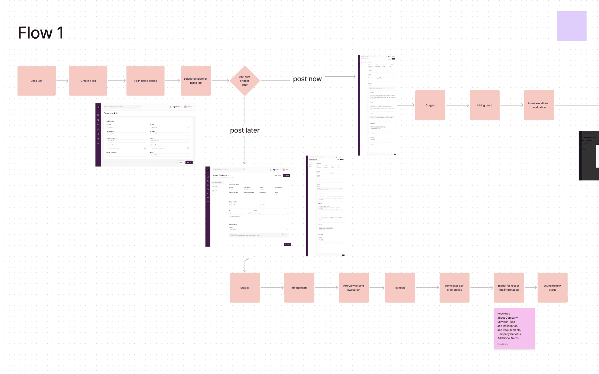
The Screens
The Job Creation Module
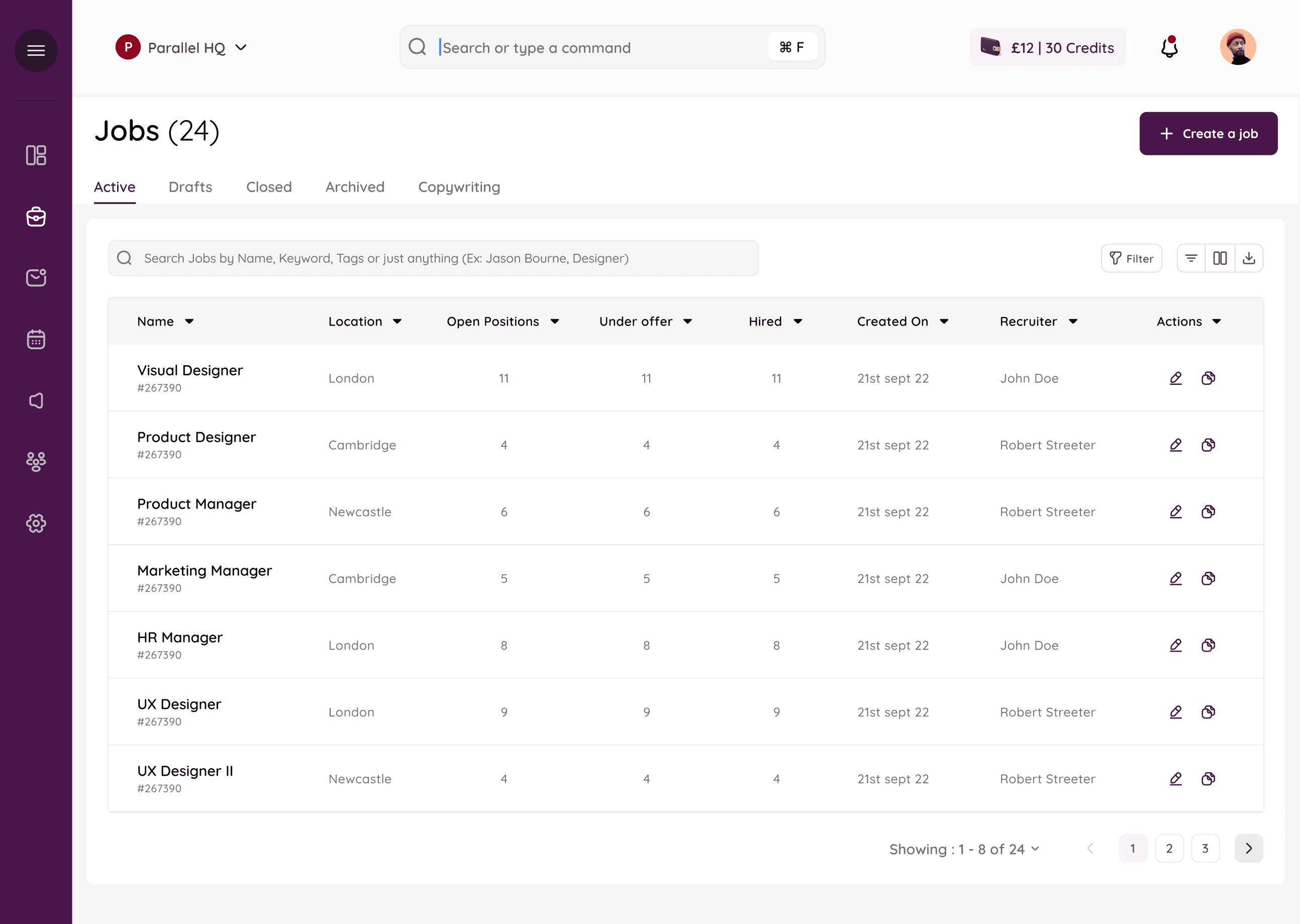
The Jobs Table: Showing the list of active job postings and relevant details.
The Screens
The Job Creation Module
The Jobs Table: Showing the list of active job postings and relevant details.
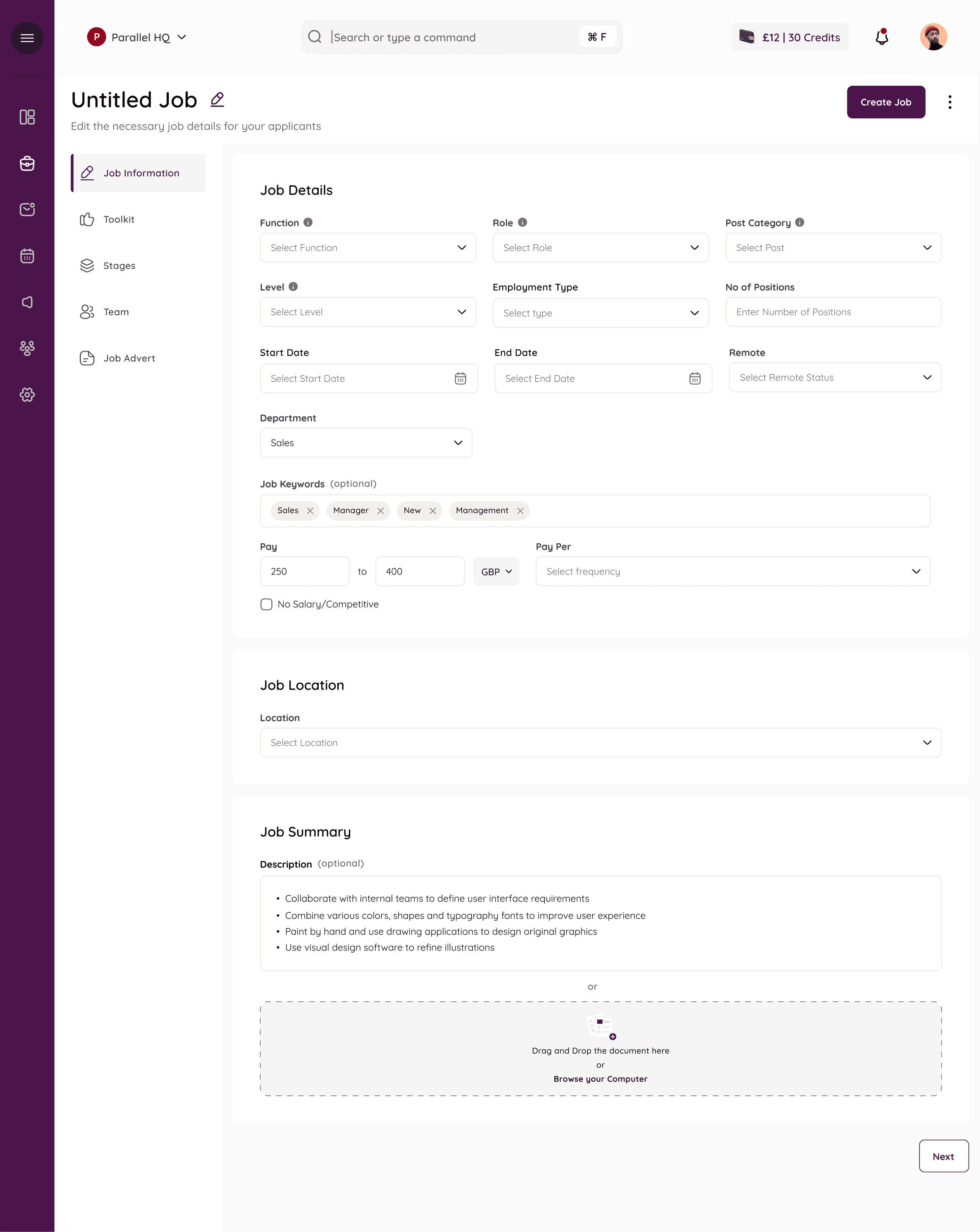
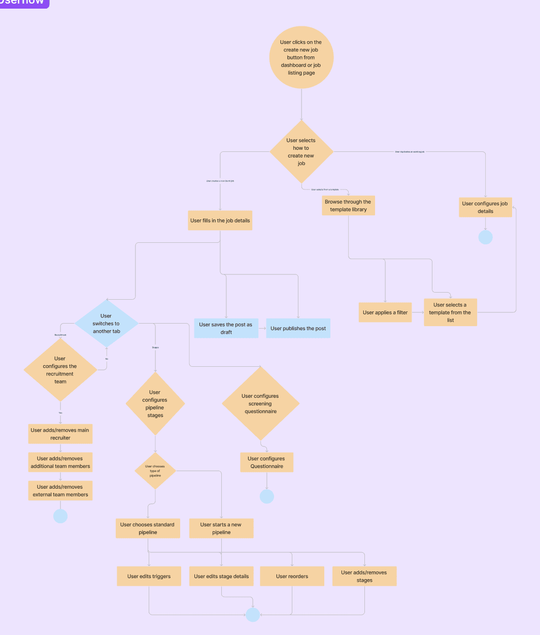
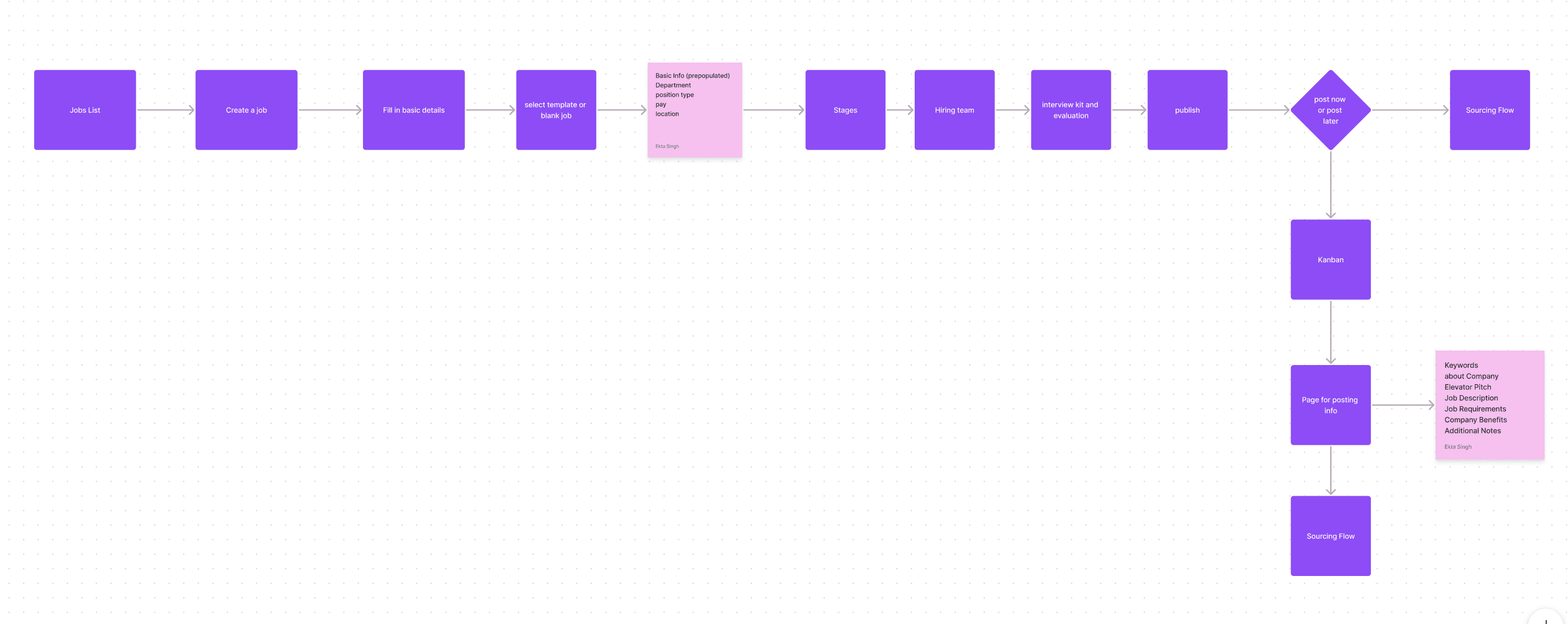
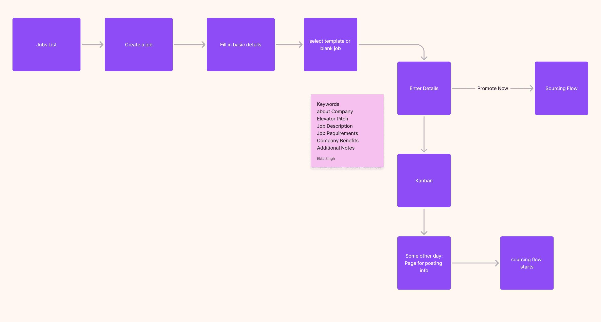
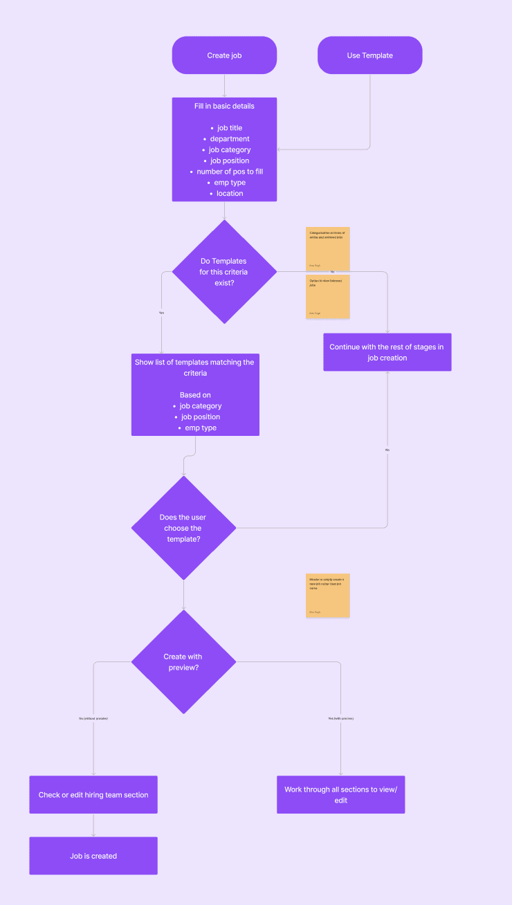
Creating a new Job : The creation procedure is split into five steps. The user can also choose to use a template if they wish to.
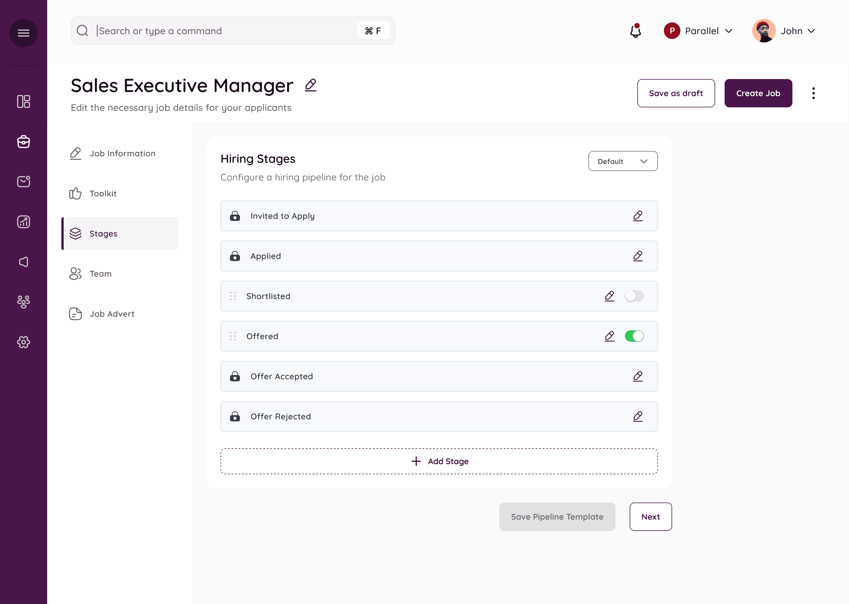
Creating a new Job- Stages : Each job has it’s unique stages for the interview process. Hiring Stages can have default stages ( which are denoted with a lock, these are stages that are necessary and common across all hirings.) Users can choose to add more stages for any particular job which they can toggle on or off.
Adding a new stage to the customized pipeline
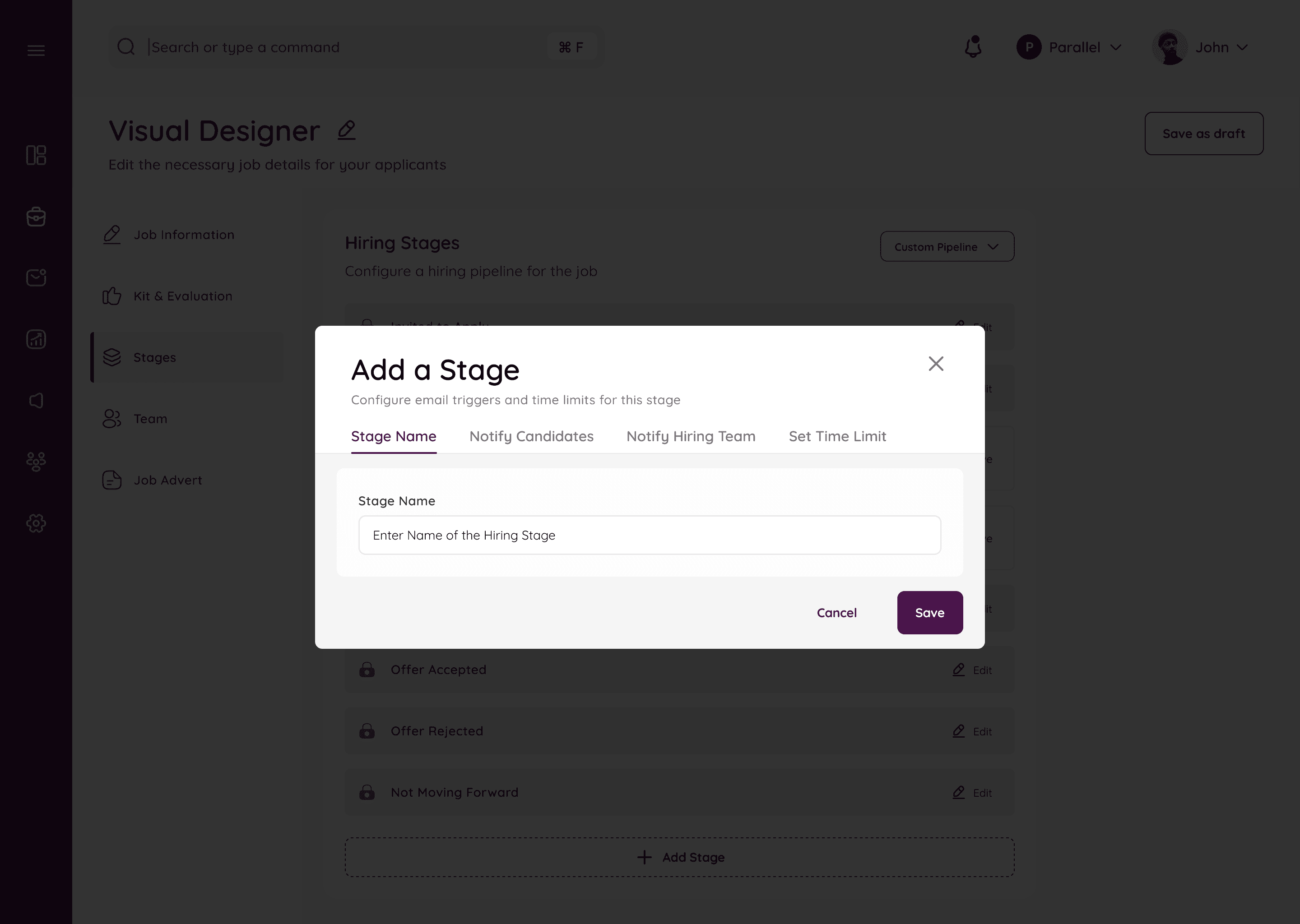
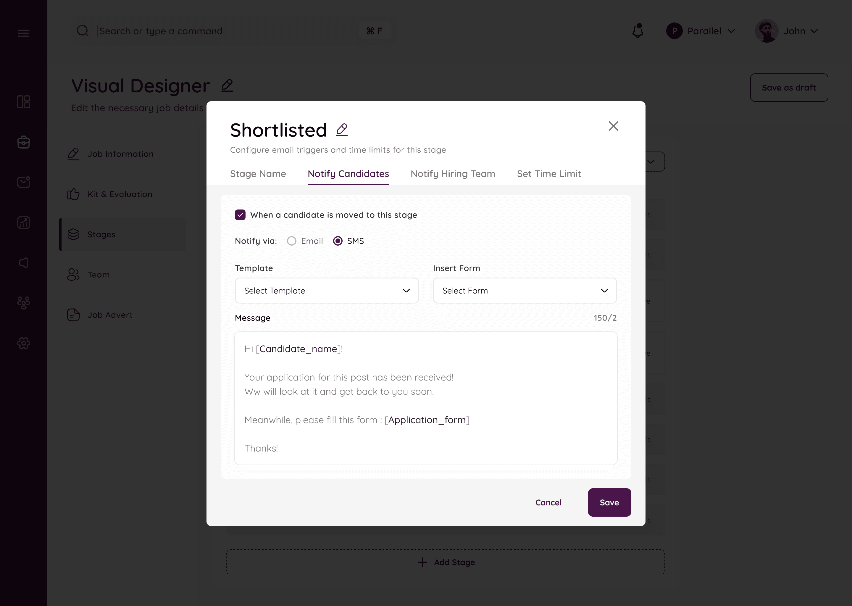
Decide what happens on each stage, if notfications need to be sent or not.
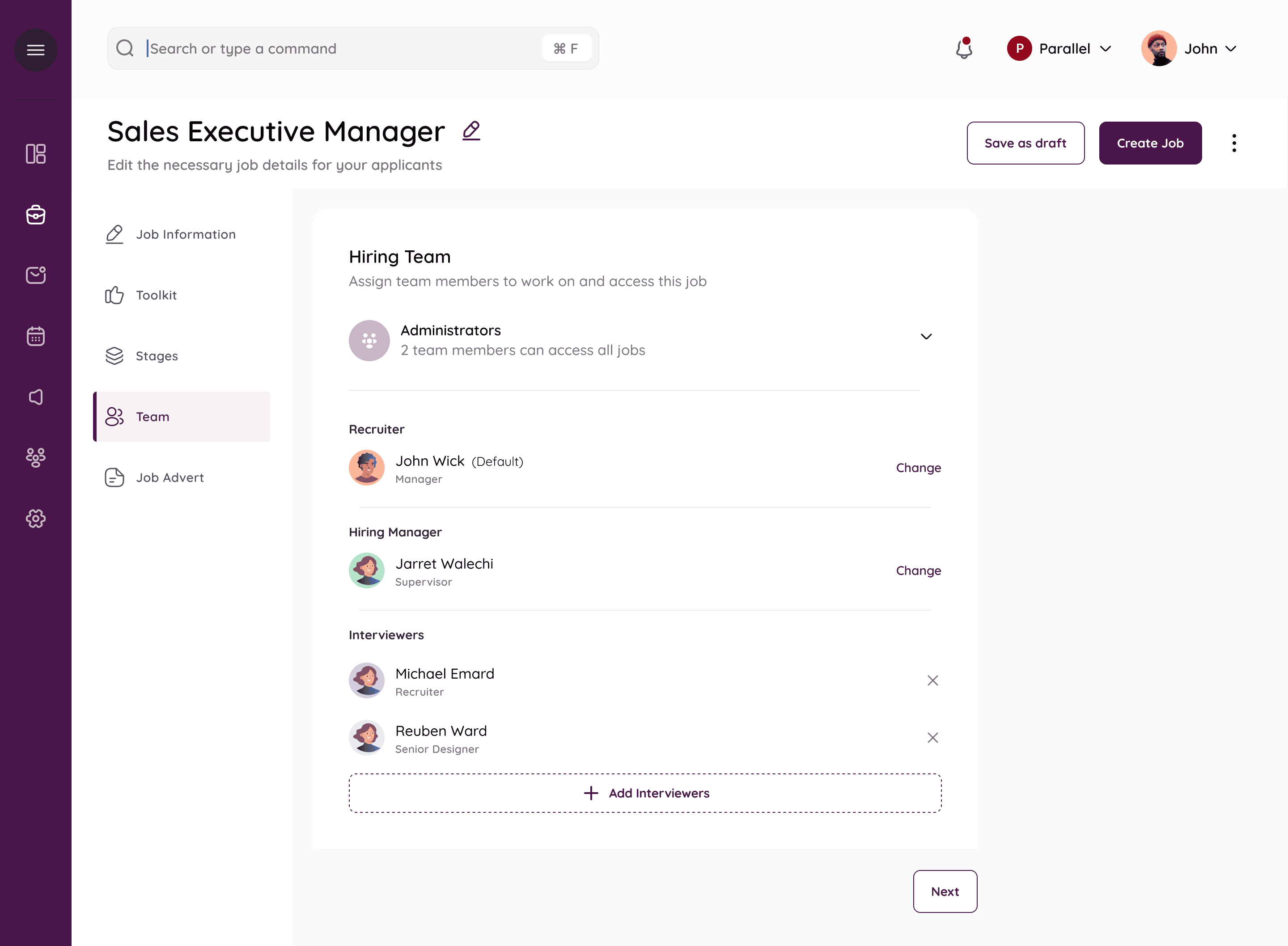
This step consists of giving access and deciding the hiring panel. There is one recruiter by default and one hiring manager. The admin has access to all jobs, and all actions on those, like a super admin who can change recruiters or hiring managers.
Multiple interviewers can also be added/removed.
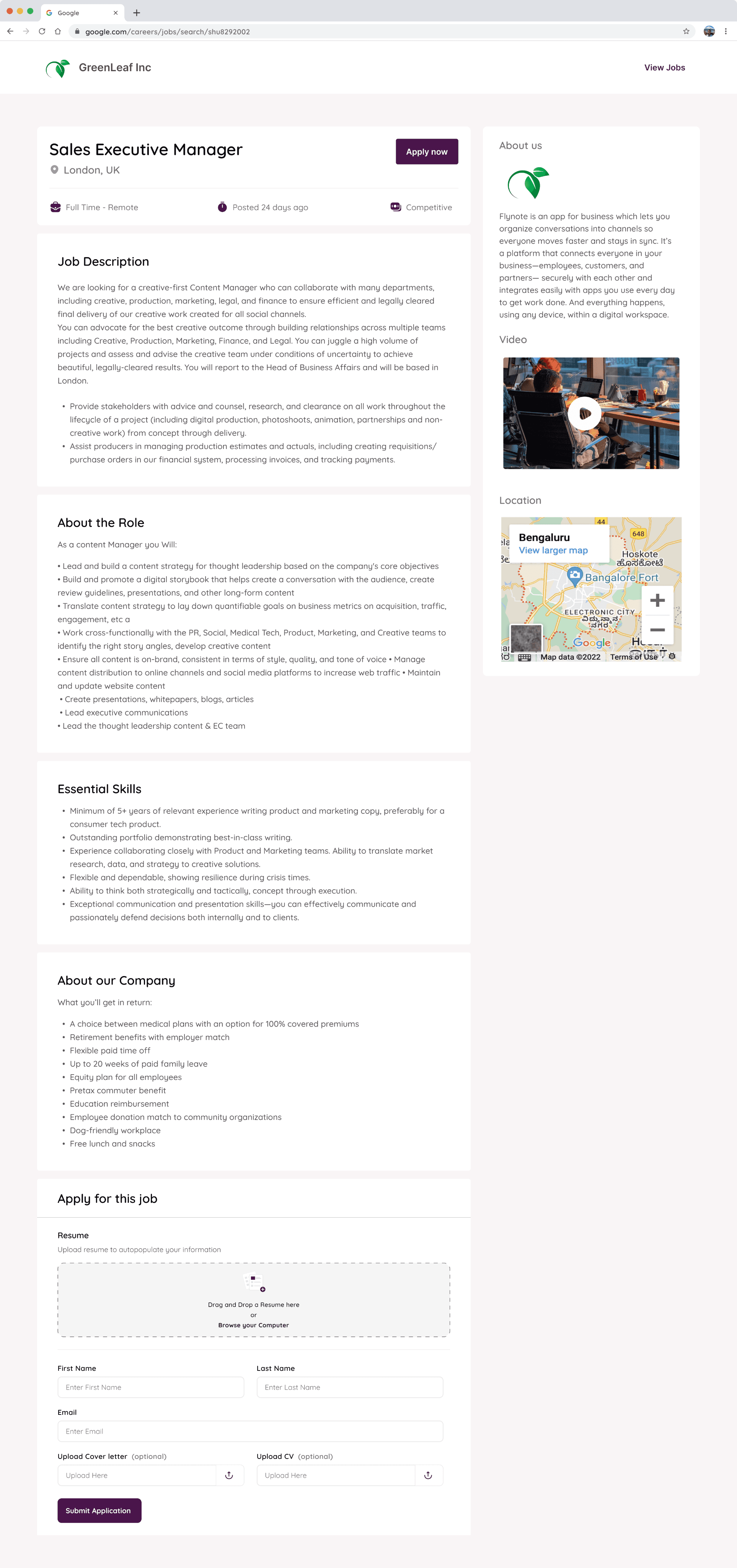
Job Posting Preview
The Kanban
Once the job is live, it appears on the jobs list. and on clicking inside each job , the user is directed to a kanban board
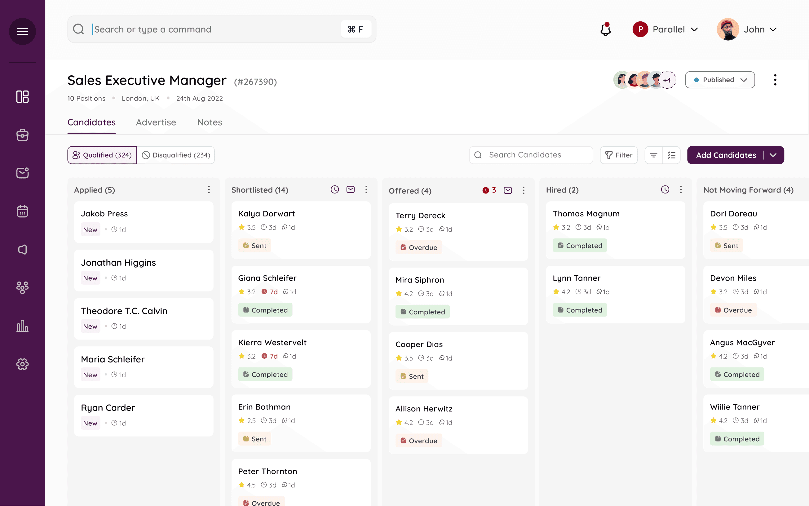
Each applicant’s status can be tracked through the Kanban and they can be dragged and dropped to any stage. Each new candidate sits at the ‘applied’ bucket, and the recruiter can move the candidate as the interview progresses. The tags on each card refer to any forms the candidate may have been sent.
Default Stages
Qualified/disqualified tabs
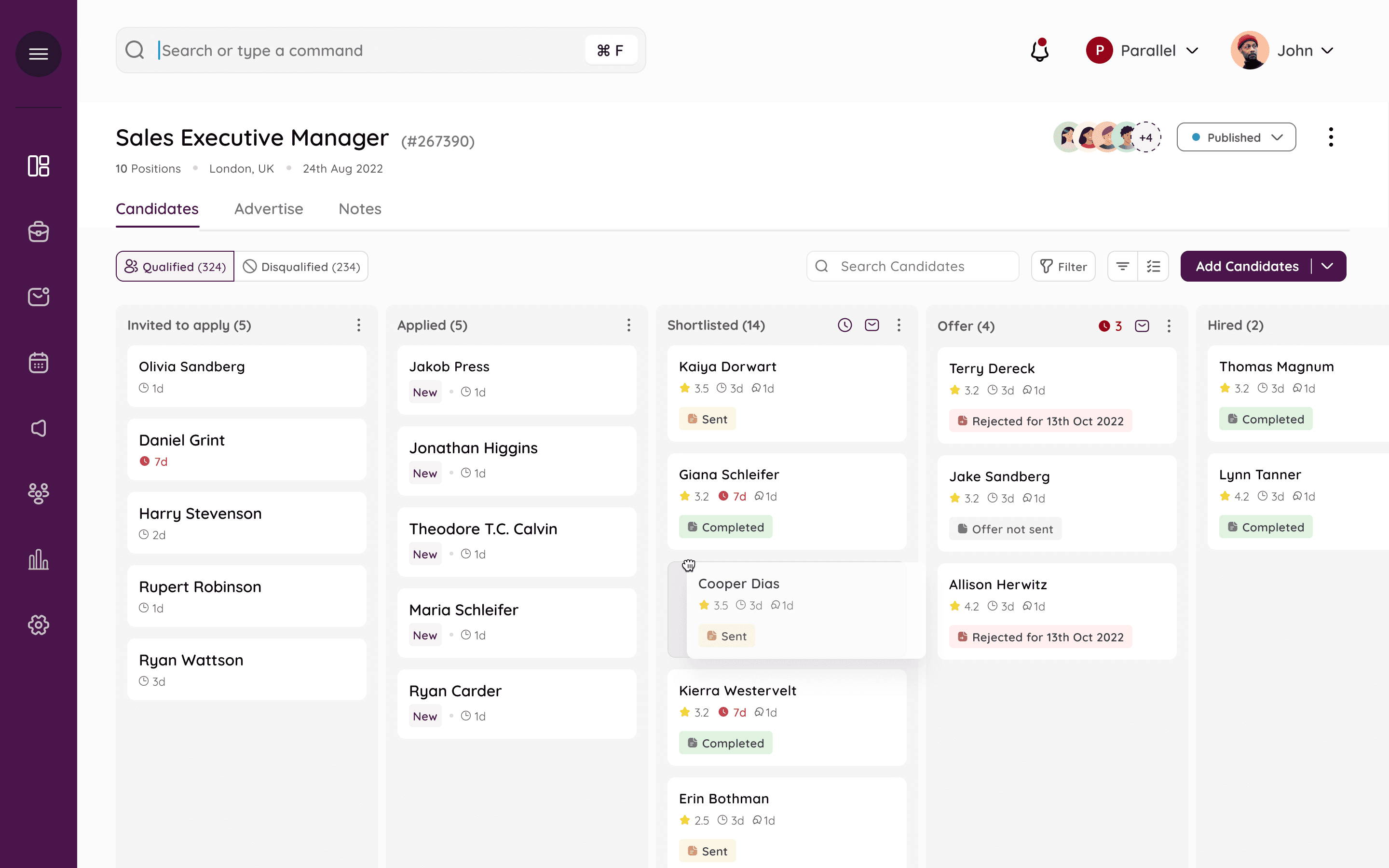
Recruiter can do a lot of things on the Kanban, like easily drag and drop from one stage to another.
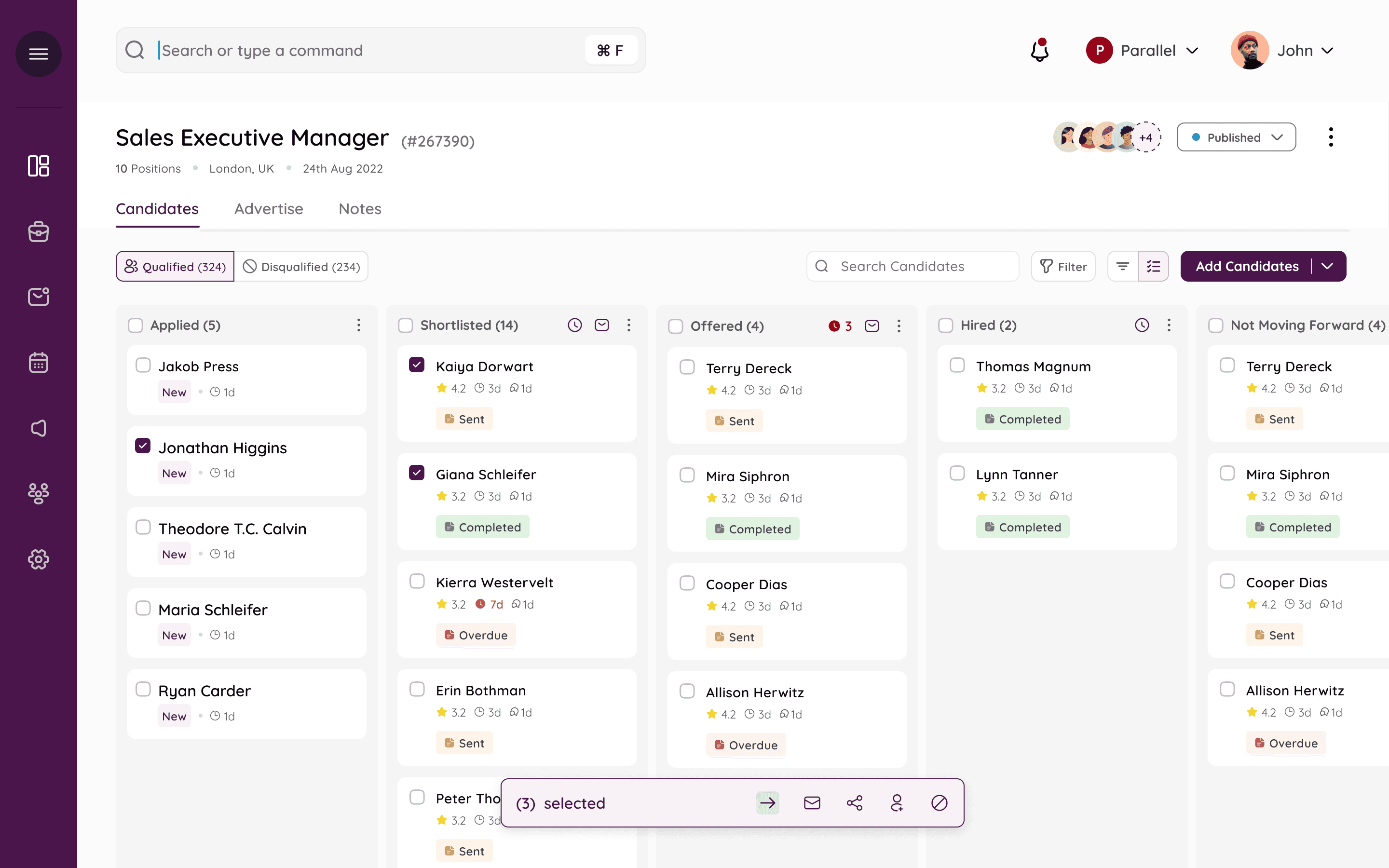
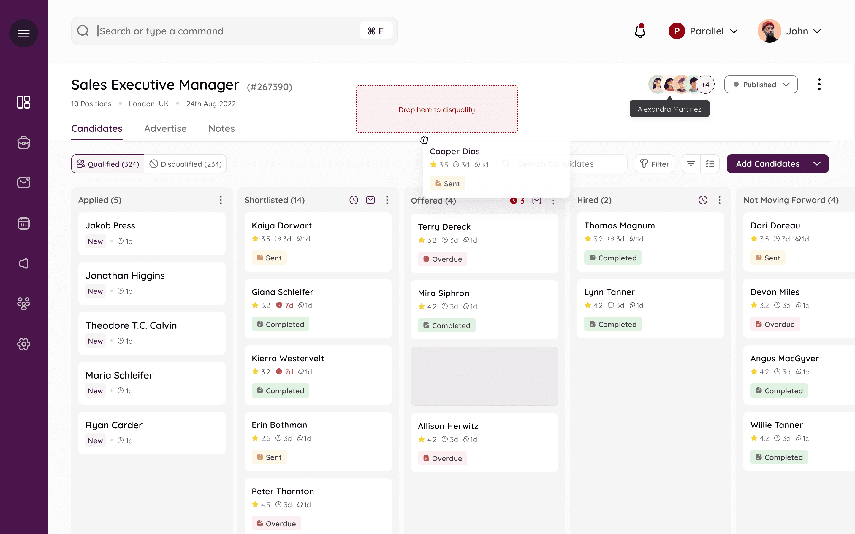
Multi-select and disqualify
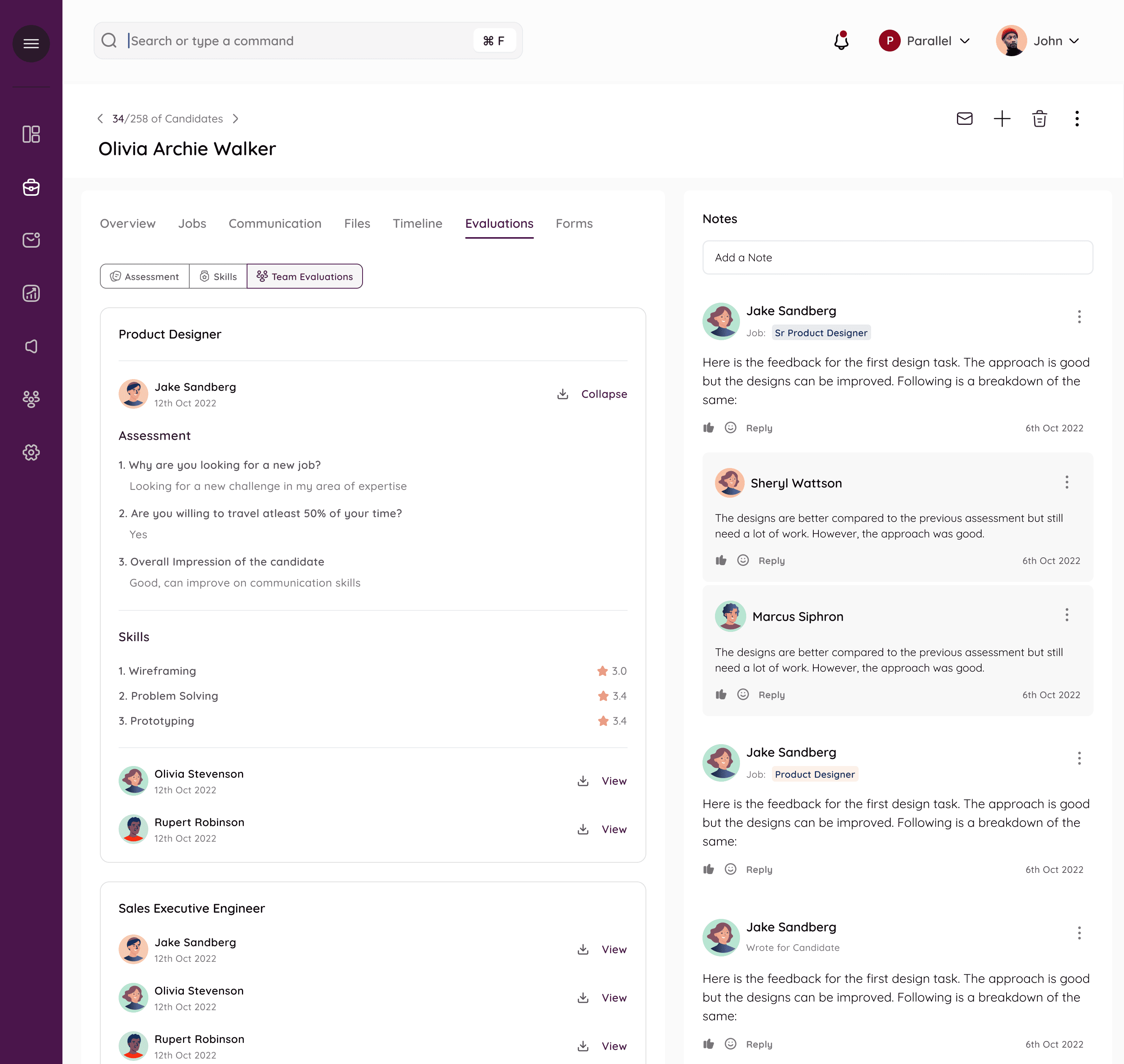
The Candidate form View
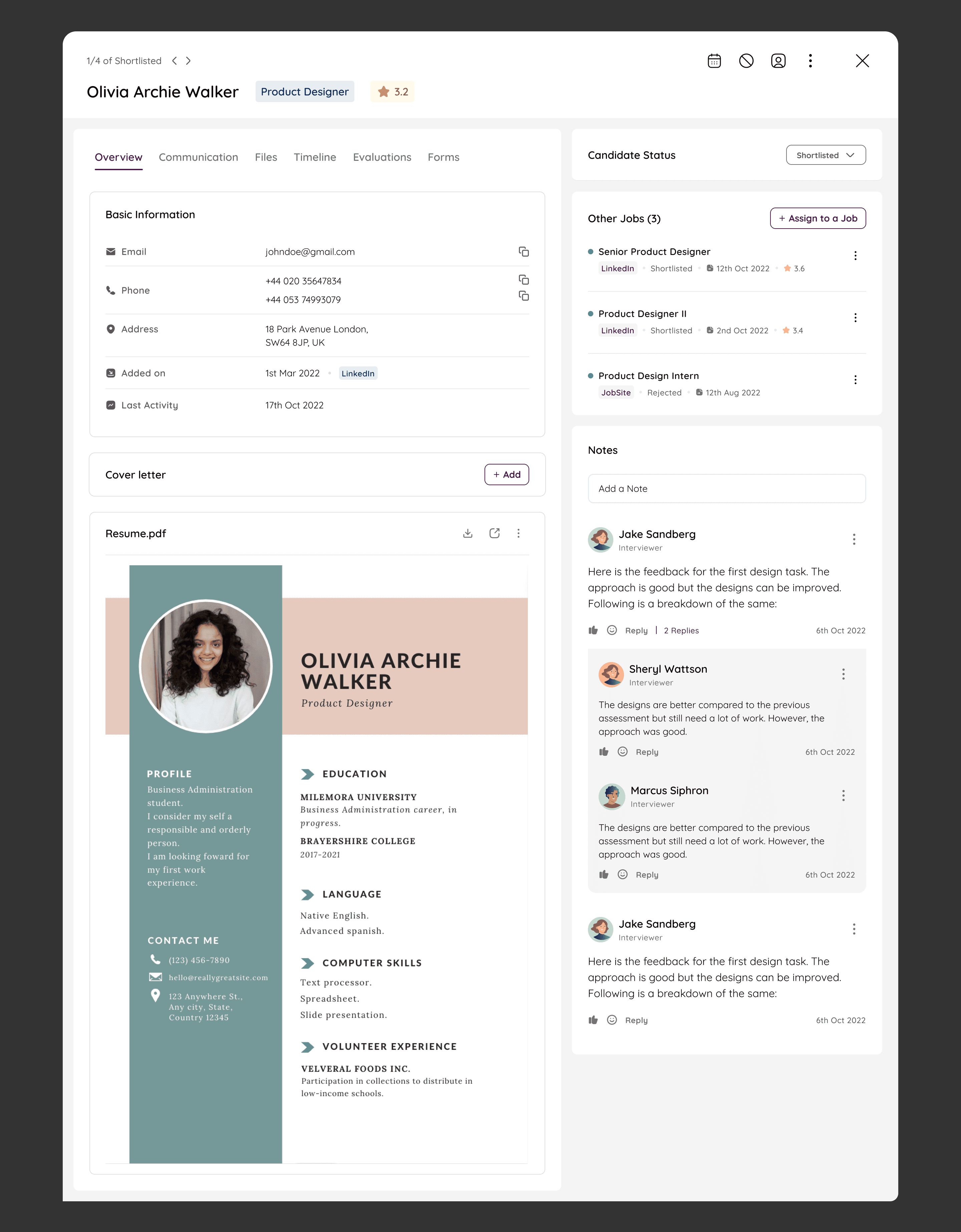
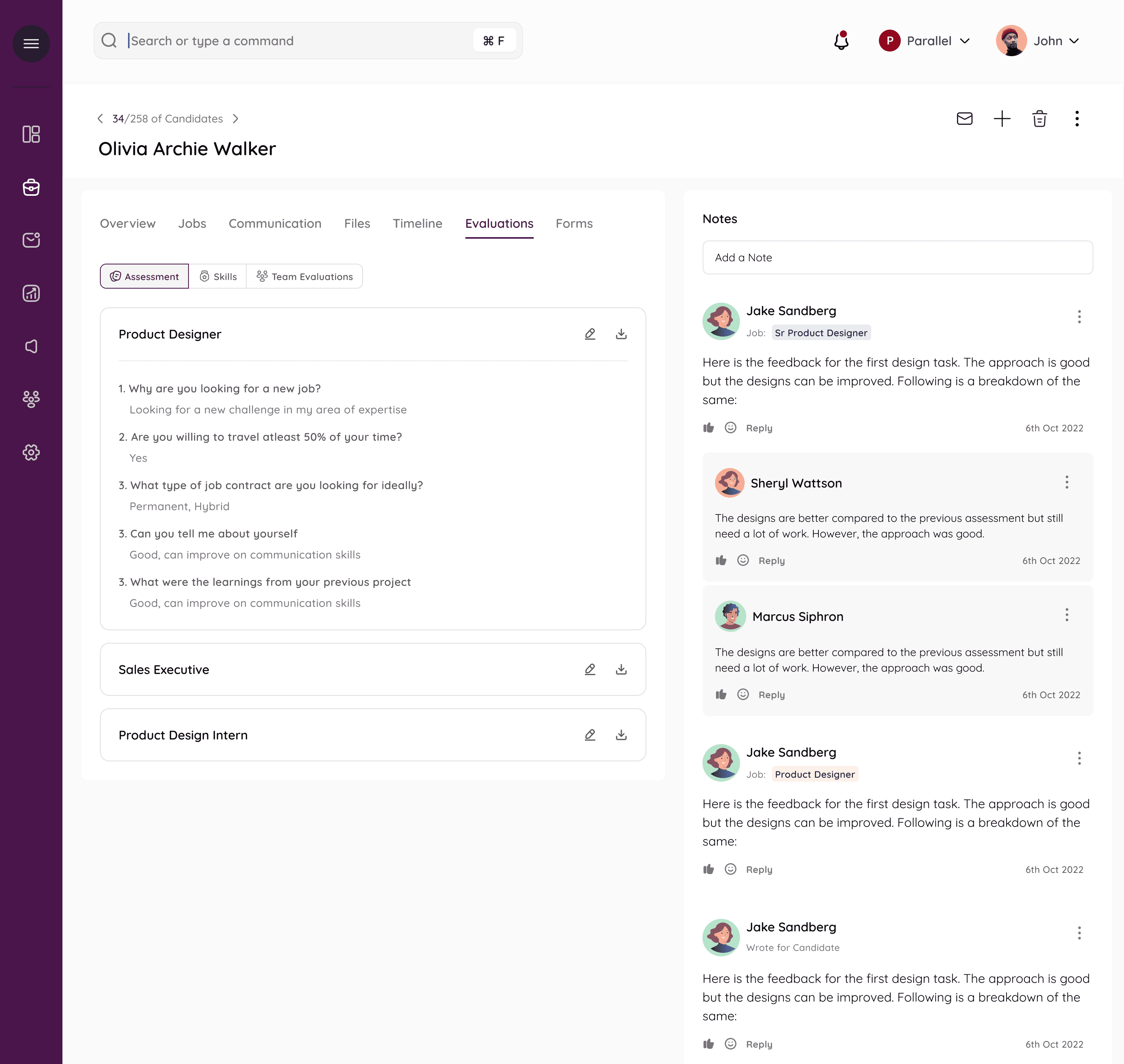
Other tabs - such as evaluations, where one interviewer can enter their assessments in the form or ratings ot comments and the rest of the team can also access them.
Also allows for collaborative hiring.
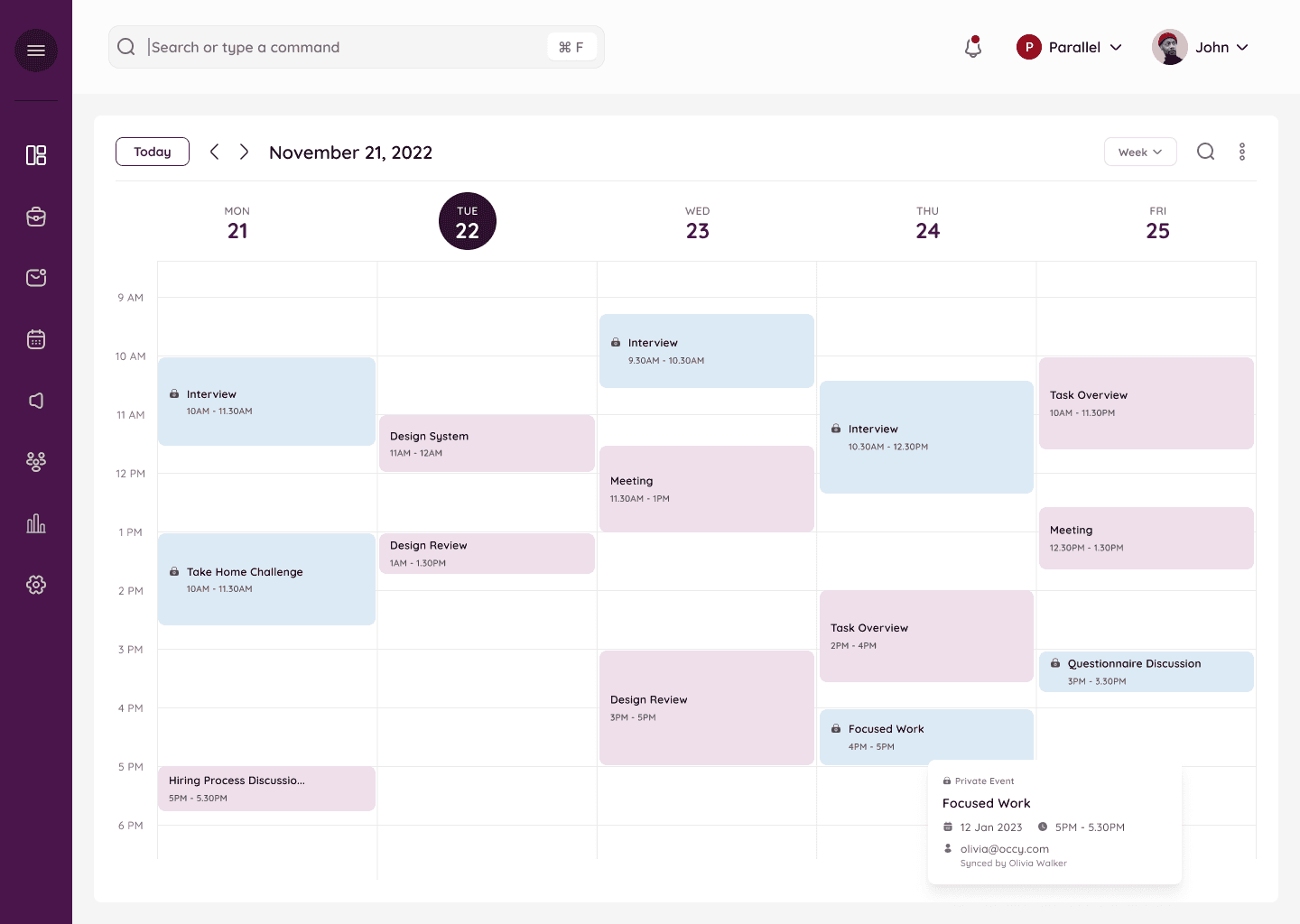
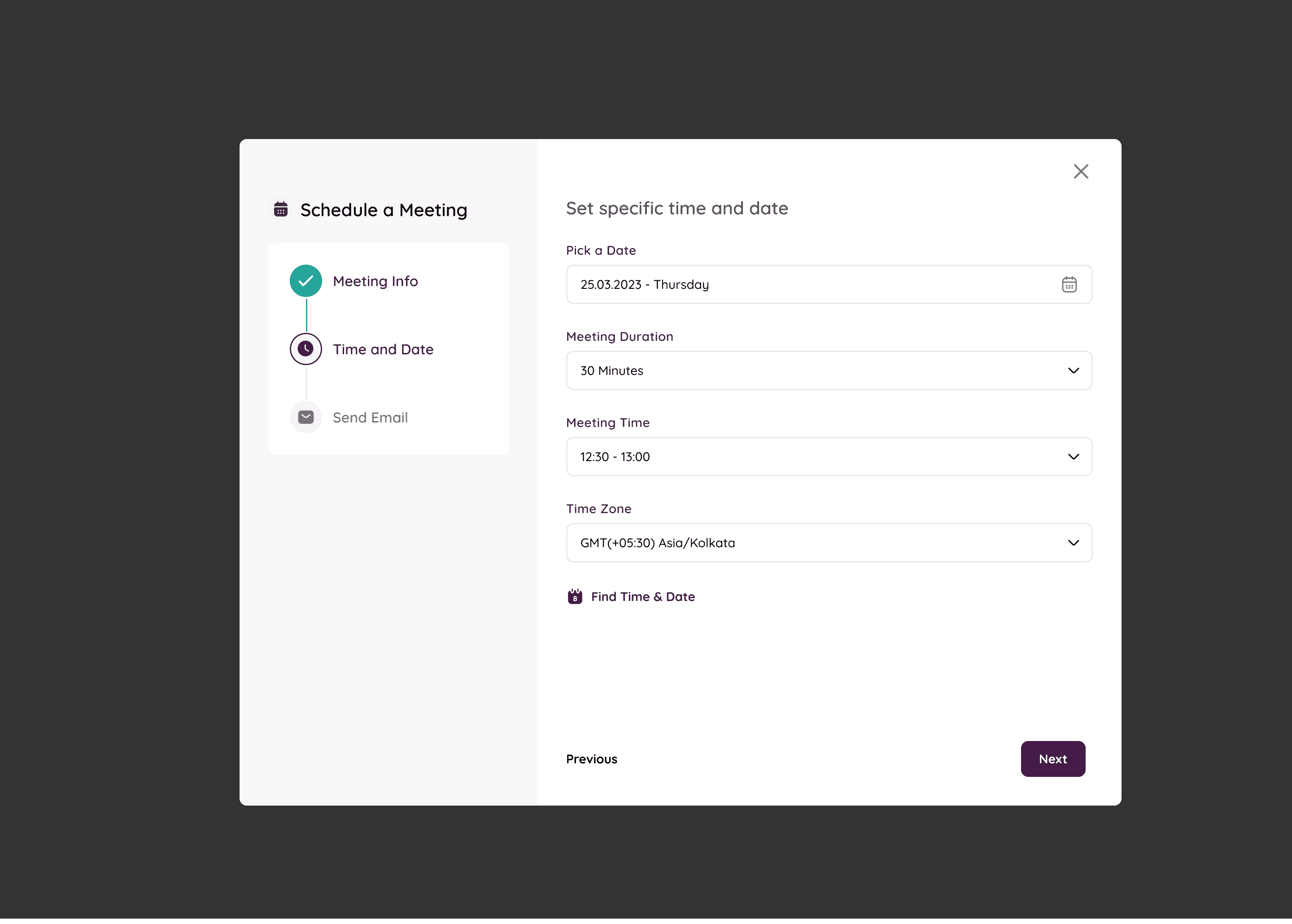
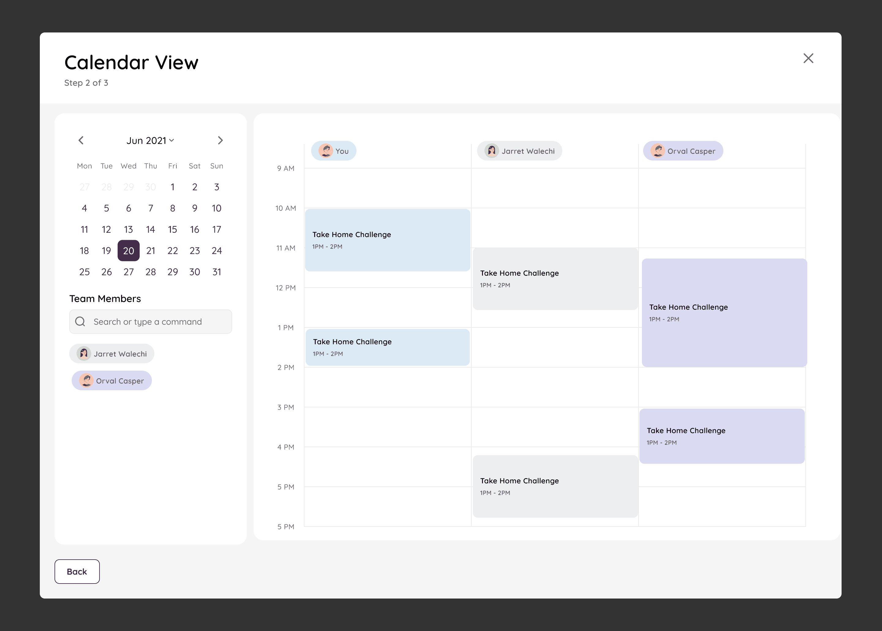
Calendar UI
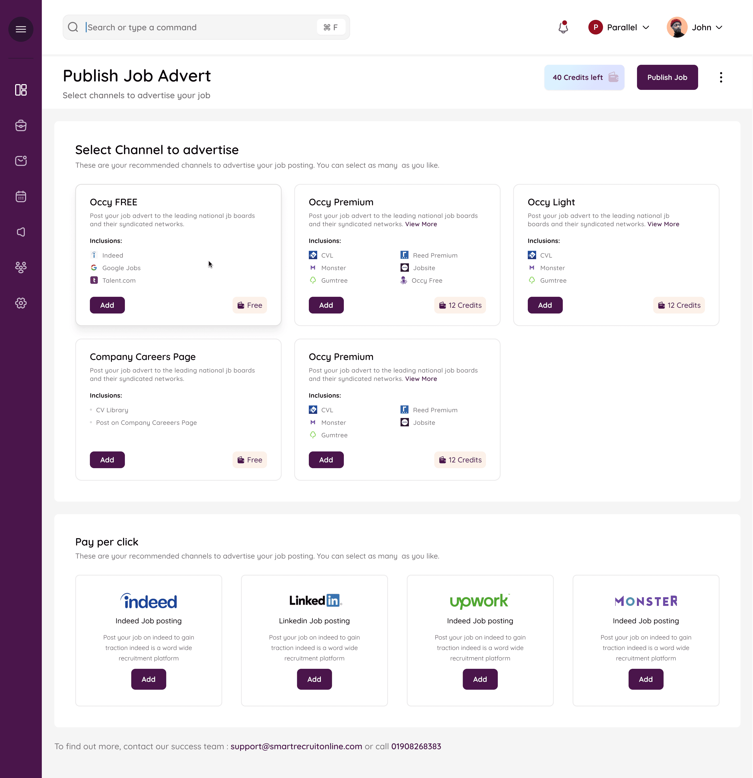
Campaigns
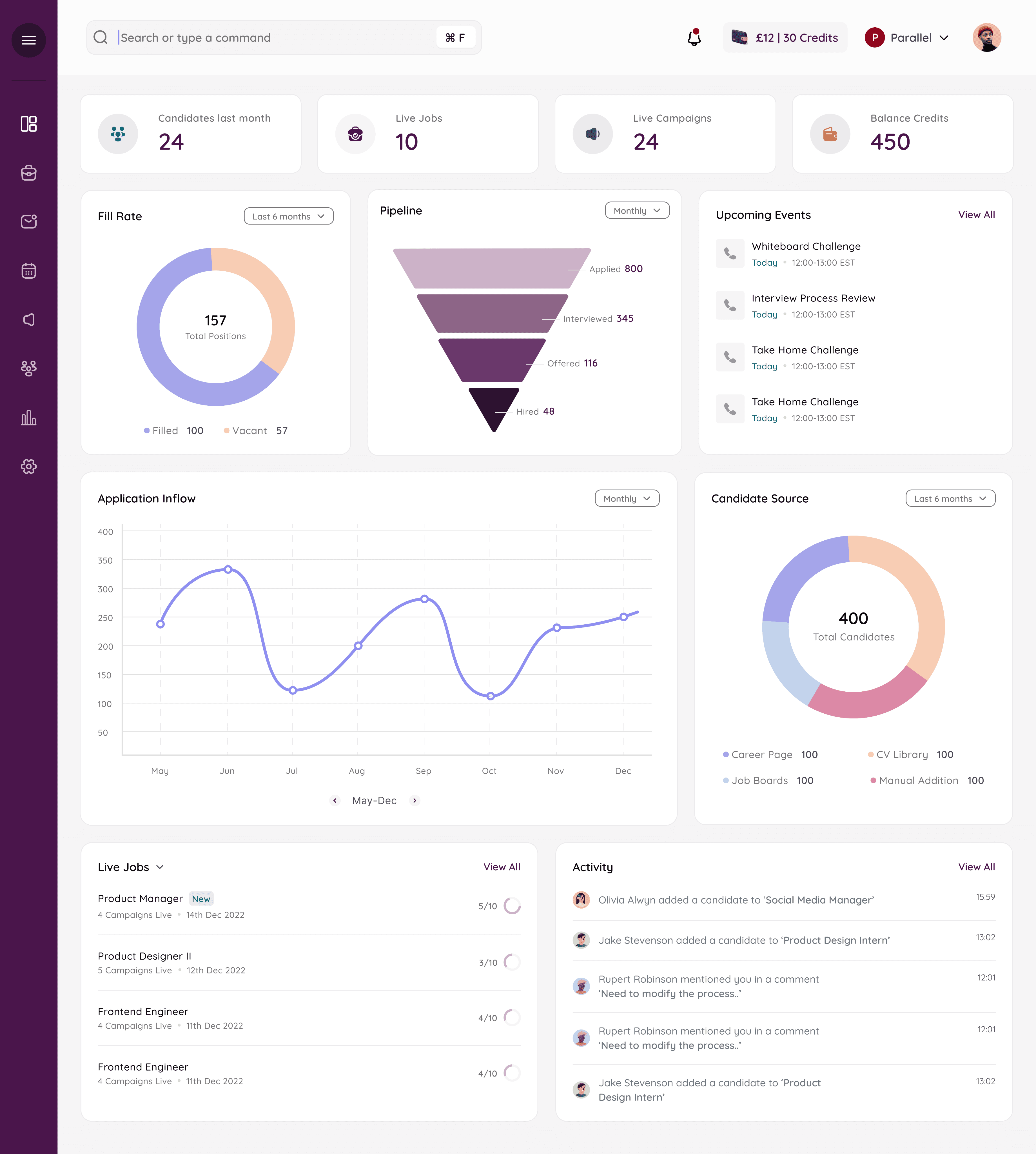
The Dashboard
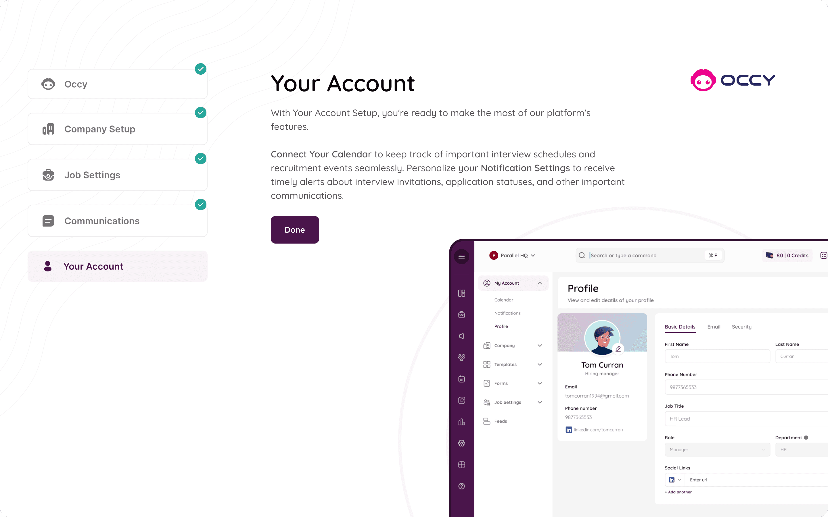
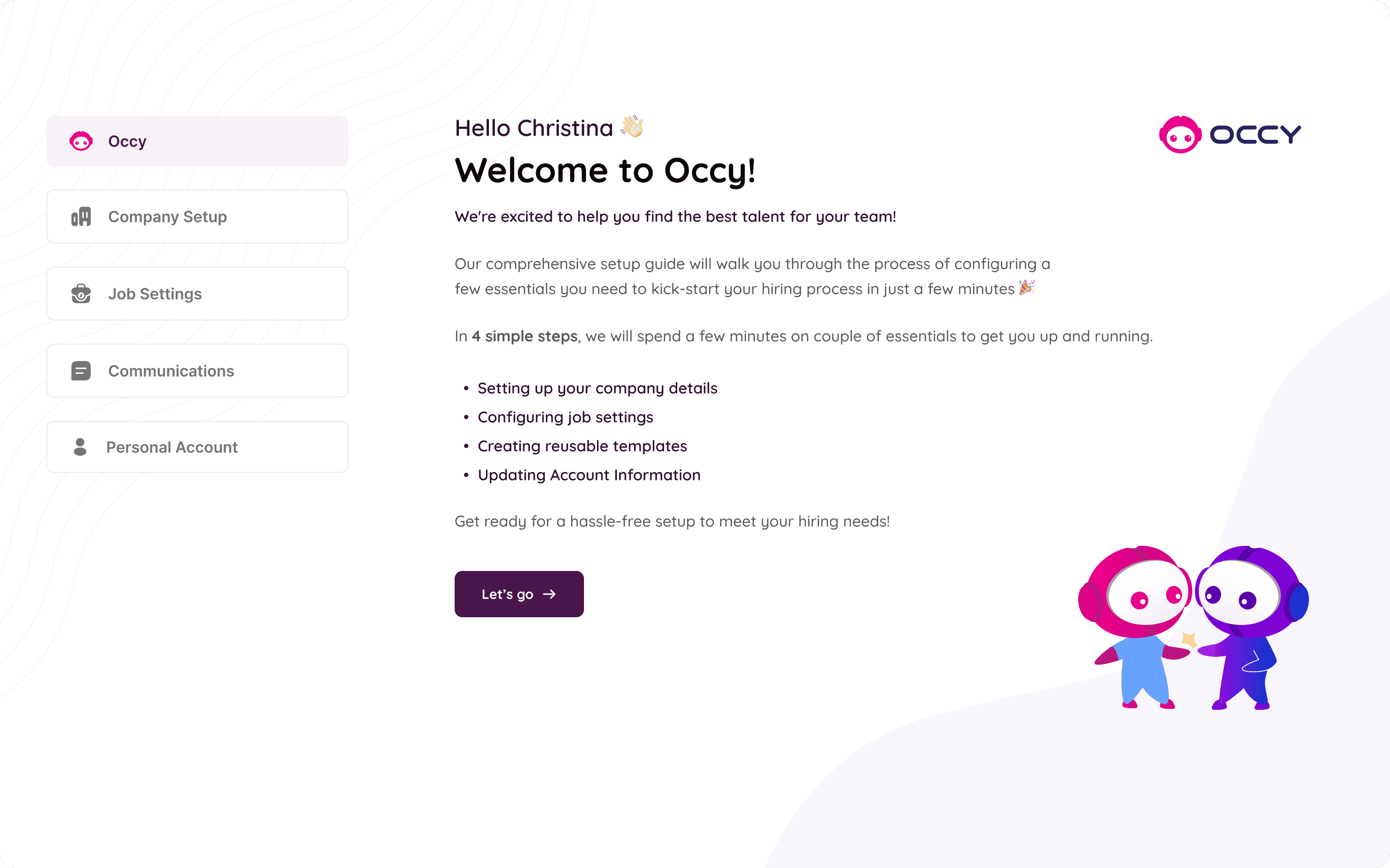
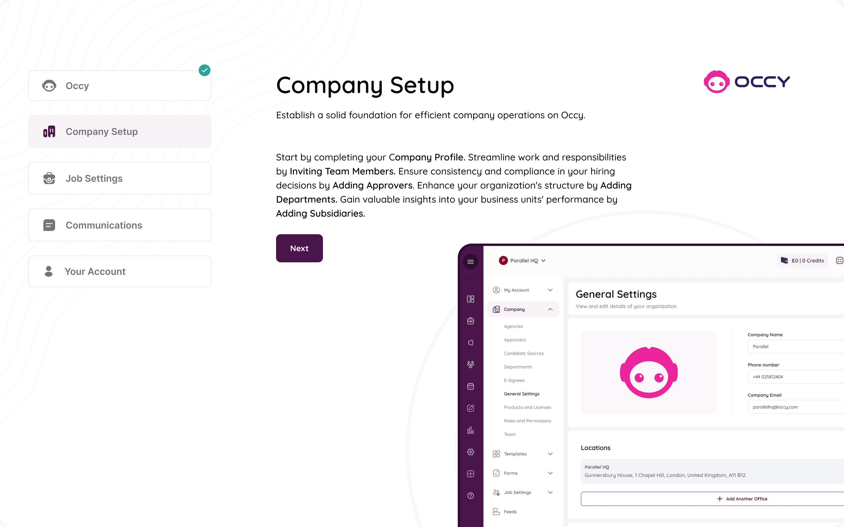
The Onboarding
Not Everything was smooth sailing...
This case study is pretty, but the process was anything but!
Let’s dive into some of the messy bits of the process.
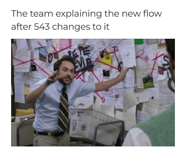
Revisions, Revisions and some more Revisions. Took us forever to align on one flow.
Our Screens becoming too similar to our references. And having to be very conscious about not repeating that once we realised our mistake.
Lots, Lots and Lots of zoom meetings, recordings and transcribing. (What happens when teams are remote).
(And lots of - this meeting could have been an email moments)

(Making flows, redoing flows, redoing those flows again) x 4
Pouring your heart and soul into a solution and it getting rejected. 💔
Having to learn the hard way that you cannot attach yourself to a solution.
Scratching our heads on how to make a SaaS screen look less boring
Prototyping so complex spiderman’s webs looked simple. 🕸️
If you made it till here, thanks! :)
read another case study